Clarify the architecture.
Navigation and page structure were reorganized around the decisions visitors actually needed to make, creating clearer routes into services, education, products, and community.

Case Study · Website Transformation
A growing motherhood brand had expanded beyond the website built to support it. The project reorganized a complex mix of services, education, shopping, and membership pathways into a clearer, calmer experience.
STRATEGY · UX STRUCTURE · DESIGN DIRECTION · SERVICE ARCHITECTURE · SHOP RESTRUCTURING · SYSTEMS INTEGRATION
View Live Site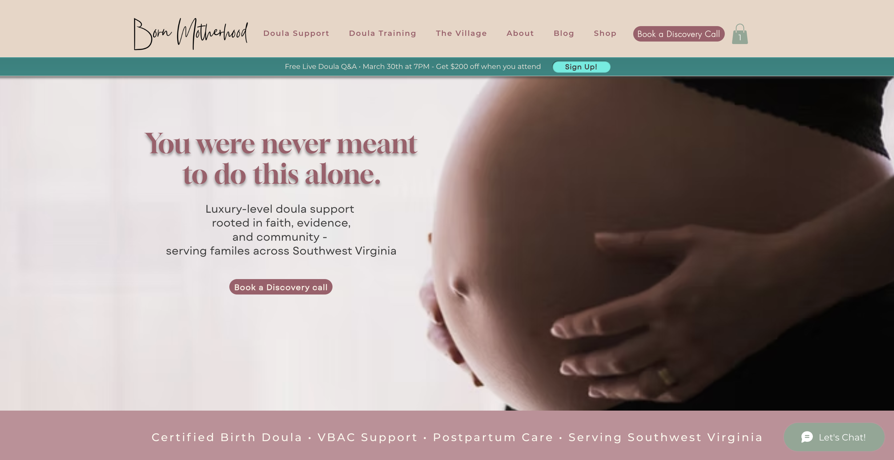
The Challenge
Born Motherhood had evolved into a multi-offer business with services, educational resources, products, membership pathways, and supporting systems all living within the same digital ecosystem.
The problem was no longer simply how the website looked. Navigation had become harder to follow, related offers felt disconnected, and visitors had too many competing paths without enough guidance about where to begin.
The goal was to simplify the experience without flattening the business underneath it.
The Strategy
Navigation and page structure were reorganized around the decisions visitors actually needed to make, creating clearer routes into services, education, products, and community.
Service pathways were restructured so related offers felt like parts of one business rather than separate destinations competing for attention.
The shop, membership access points, calls to action, and supporting systems were aligned to make it easier for visitors to understand what was available and take the next step.
What Was Built
This was a full website reset built around the structure of the business itself - bringing services, education, commerce, membership, and supporting systems into a more cohesive experience.
Reorganized a growing set of services and support options so visitors could understand what was available and identify the path that best matched what they needed.
Reduced clutter and created more intentional movement between major areas of the website, making a larger business feel easier to understand.
Reworked product organization and shop flow to create a more usable shopping experience across the brand's digital and physical offers.
Aligned website pathways with checkout, fulfillment, membership access, and related supporting systems so the customer experience worked more cohesively.
Connected Experience
Different parts of the business, organized around one customer journey.The Outcome
The finished website better reflected the scale and depth of Born Motherhood while giving visitors clearer ways to understand the business, explore its offers, and move toward inquiry.
Within the first 48 hours after launch, the site generated four discovery calls - an early signal that the new inquiry pathway was working.
In the first week after launch, Born Motherhood booked more consultations directly through the website than it had ever booked previously.
Services, shopping, membership, and supporting systems worked together as parts of one customer experience, giving visitors clearer pathways from exploration to action.
Project Snapshot
Client Perspective
“She has an incredible gift for truly seeing people, understanding their vision, and translating that vision into a website that feels authentic, strategic, and deeply aligned with their brand.
Every page feels intentional. Every detail serves a purpose. The site doesn't just look beautiful - it connects with people, builds trust, and converts visitors into leads.
The results were almost immediate. Within hours of launching our new website, we saw a significant increase in website traffic. In the first week alone, we booked more consultations directly through our website than we had ever booked previously.”
What This Project Demonstrates
Born Motherhood did not need to become a simpler business. The website needed to become better at explaining a complex one.
The reset created structure around that growth so visitors could understand the offers, move between pathways, and take action with less friction.
Your Story Next
If your offers have expanded but your website still reflects an earlier version of the business, we can rebuild the structure around what you have become.
Start a Project