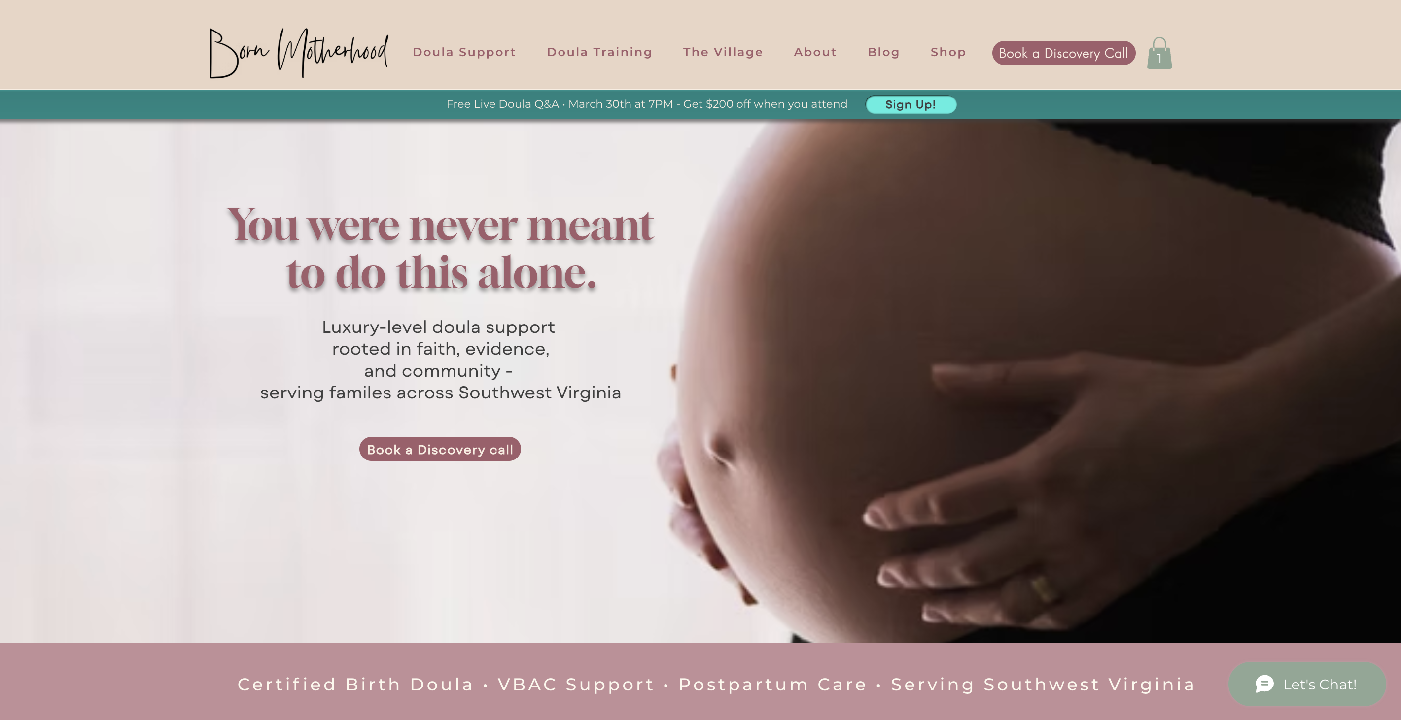
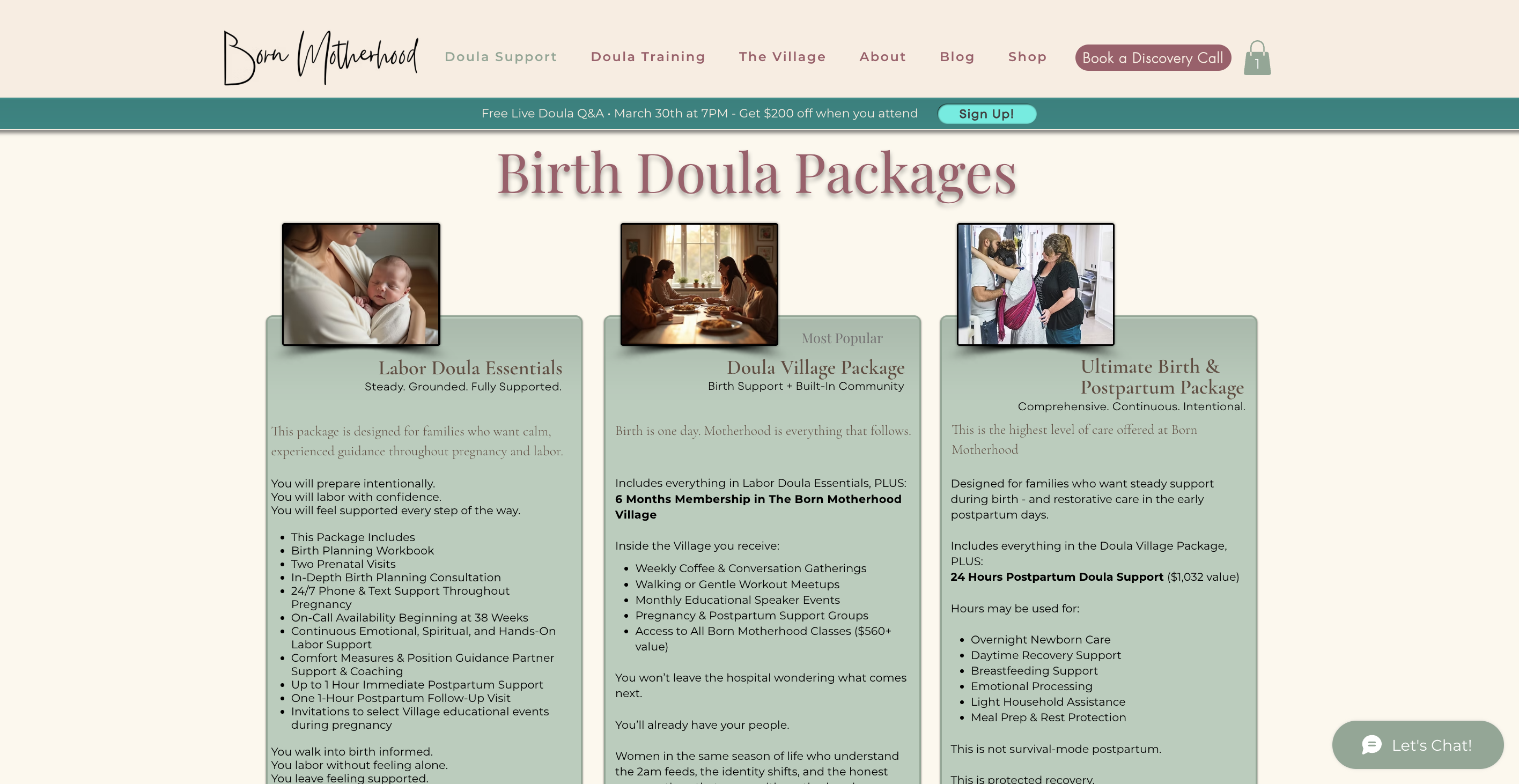
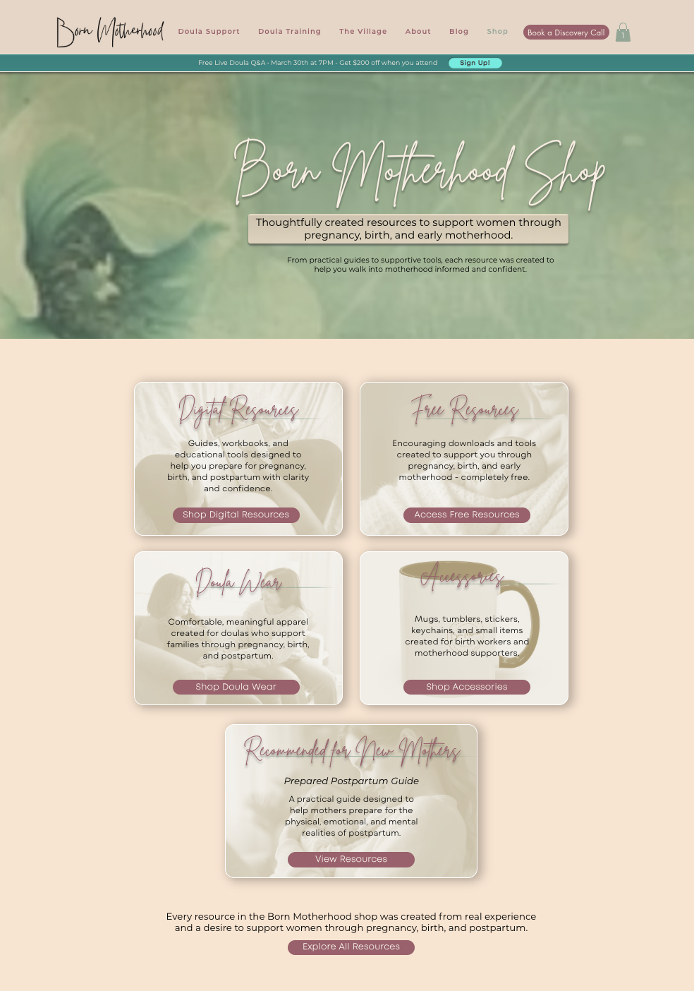
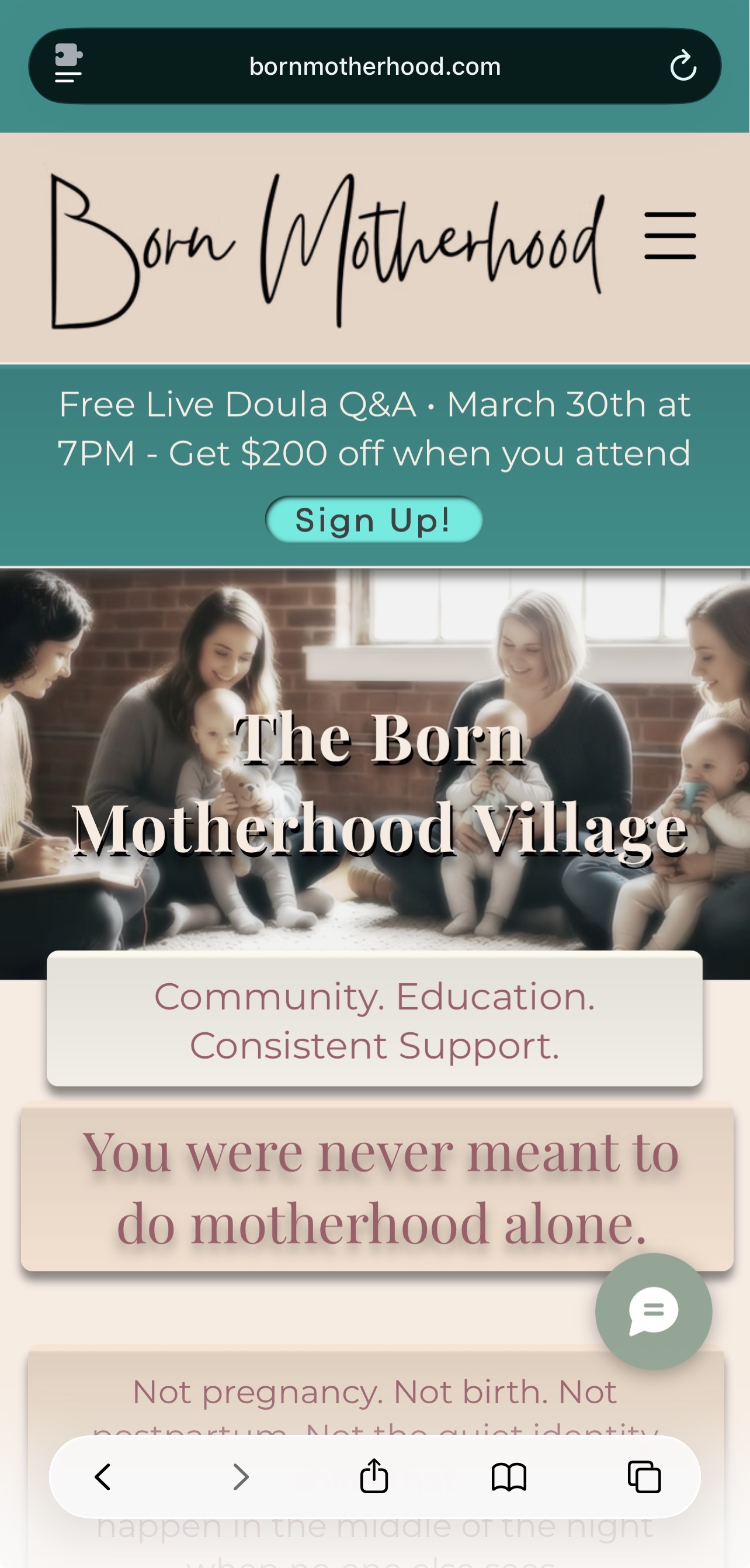
Case Study • Client

Born Motherhood

A growing motherhood brand whose website no longer matched the depth of its offers — restructured into a clear, conversion-ready experience that guides visitors toward trust, understanding, and action.

This reset simplified navigation, clarified service pathways, and aligned multiple offers into one cohesive system — making it easier for people to move through the site and know exactly where to begin.

Strategic website reset for a multi-offer motherhood business, including services, shop, and membership pathways.

Results after launch

4 discovery calls within the first 48 hours

Momentum

Immediate increase in inquiry activity after the new site went live

Industry response

Positive feedback from a marketing professional who reached out after viewing the site

Goal

Bring structure and clarity to a business that had outgrown its website.

Approach

Simplify navigation, restructure service pages, and rebuild key pathways.

Result

A clearer, conversion-ready experience that immediately increased inquiry activity and made it easier for visitors to understand, trust, and take action.

Overview

Type: Client website reset

Role: Strategy, structure, design direction, page planning, shop cleanup, and system integration support

Status: Live

Platform: Wix, with connected checkout and fulfillment tools

Born Motherhood had grown into a more expansive business than its website could clearly support. The work was not just to make it prettier — it was to create a structure that matched the depth of the brand and helped people move through its offers with less confusion.

What was built

A full website reset designed to support a growing motherhood brand with multiple offers, clearer pathways, and a more cohesive experience across services, shopping, and membership.

  • Service restructuring: reorganized offerings so visitors could understand support options more easily
  • Navigation cleanup: reduced clutter and created a more intuitive path through the site
  • Shop rebuild: restructured store flow and product organization for a more usable shopping experience
  • Membership pathway support: clarified access points for The Village and related offers
  • Integrated systems: aligned website experience with checkout, fulfillment, and digital sales tools

Why this mattered

The business had outgrown a simple brochure-style website. It needed infrastructure — not just a redesign — so the website could support growth without feeling scattered or overwhelming.

The challenge

Born Motherhood had grown into a multi-offer business, but the website had not grown with it. Navigation felt scattered, service pathways were harder to follow, and the site no longer reflected the depth or structure of the brand.

Outgrown structure

The business had expanded, but the site still operated like a smaller, simpler version of the brand.

Scattered pathways

Visitors had too many disconnected routes and not enough clarity about where to go next.

System complexity

Services, shop, membership, and digital tools all needed to work together more cohesively.

The approach

The strategy was to simplify what had become overwhelming without flattening the brand. That meant clarifying navigation, restructuring service pages, tightening the user journey, and rebuilding the store experience so the site felt more unified and easier to move through.

  • Clarity-first structure: reorganized pages to reflect the true shape of the business
  • Trust-centered pacing: created gentler pathways that supported decision-making without pressure
  • Shop cleanup and rebuild: improved product organization and flow for both digital and physical offers
  • Integrated support systems: aligned the site with checkout, fulfillment, and related platform needs

The outcome

The website now better reflects the scale and depth of Born Motherhood. It feels clearer, calmer, and easier to navigate — while supporting multiple offers in a way that feels more intentional and conversion-ready.

  • Clearer service pathways across a more complex offer suite
  • A rebuilt shop experience with stronger structure and usability
  • More cohesion between services, shop, and membership pathways
  • A website that better matches the maturity of the business

Within the first 48 hours of launch, the site generated multiple discovery calls — signaling a stronger, more effective path from visitor to inquiry.

What this kind of project usually needs

This kind of reset works best when the goal is bigger than just “make it look better.” It’s usually about helping the website catch up to the business underneath it.

Offer clarity

When a business grows, the website has to make those offers easier to understand and choose from.

System alignment

Websites, checkout, product flow, and supporting tools need to work together cleanly.

Strategic restructuring

Growth often requires rethinking the experience — not just refreshing the visuals.

Ask what fits best →

I’ll recommend the cleanest next step based on what your business actually needs.

Has your business outgrown your website?

If your offers have expanded, your website feels scattered, or your current structure no longer matches your growth, we can rebuild it into something clearer, calmer, and easier for people to move through.

Back to Portfolio →